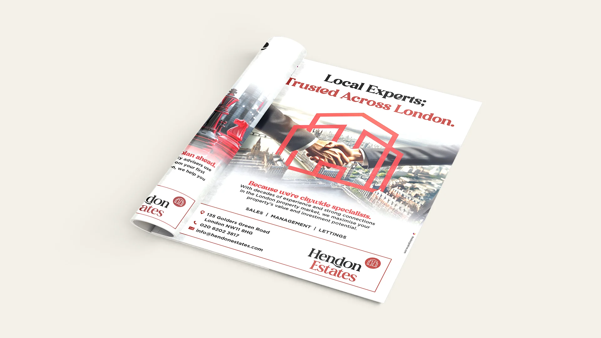
Hendon Estates had the experience, the clients and the credibility — but their brand wasn’t showing it. Their visual identity felt dated and functional, which made their service appear less trustworthy than it truly was. In property, perception is everything, and they risked being overlooked simply because they didn’t look like the strongest choice.
We approached the project as a business problem, not a cosmetic one. Through a full brand audit, audience mapping and positioning work, we uncovered what made Hendon Estates genuinely different: calm professionalism, deep expertise and effortless approachability.
From there, we rebuilt their brand to look and feel unmistakably first-choice.
What We Delivered:
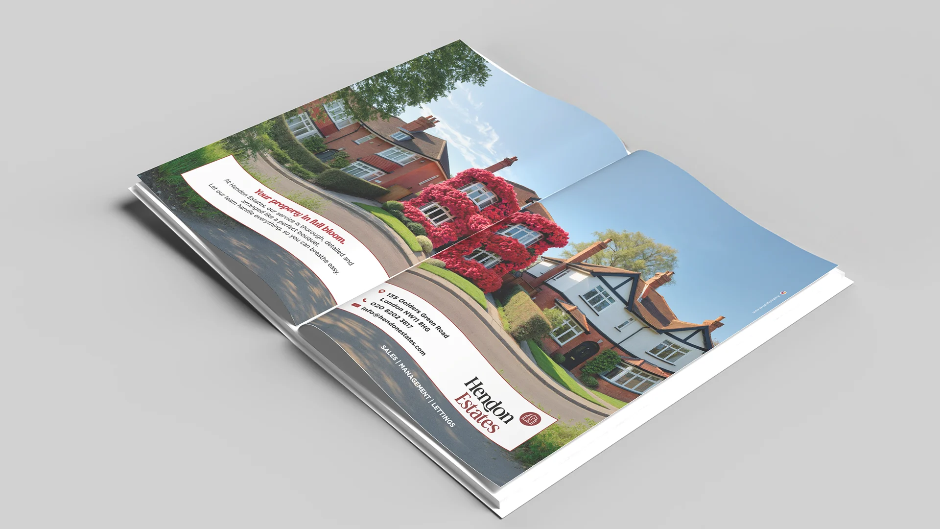
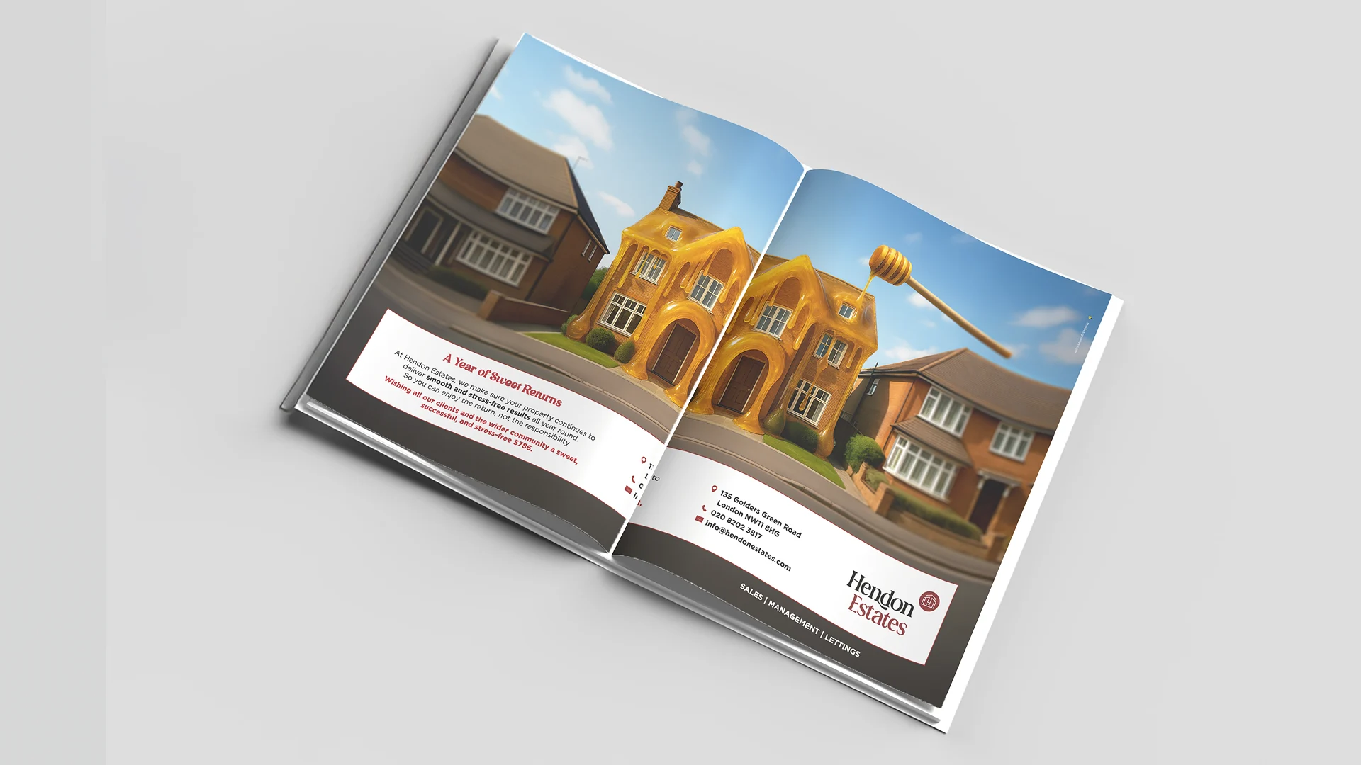
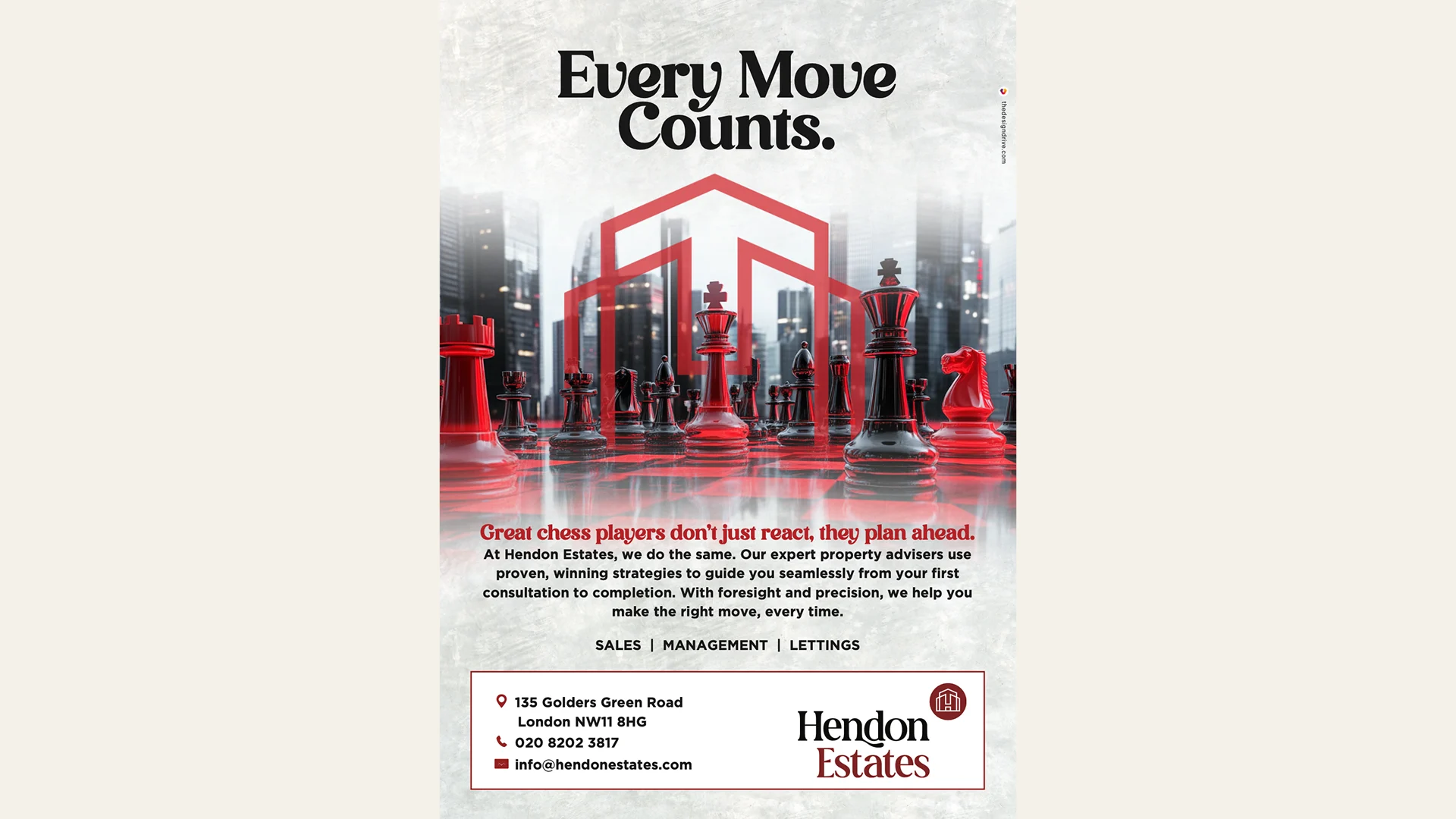
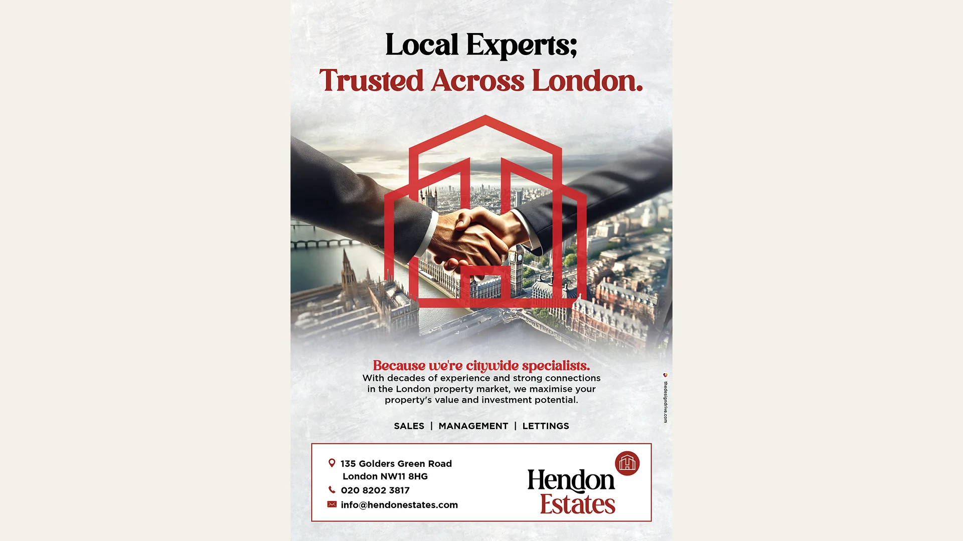
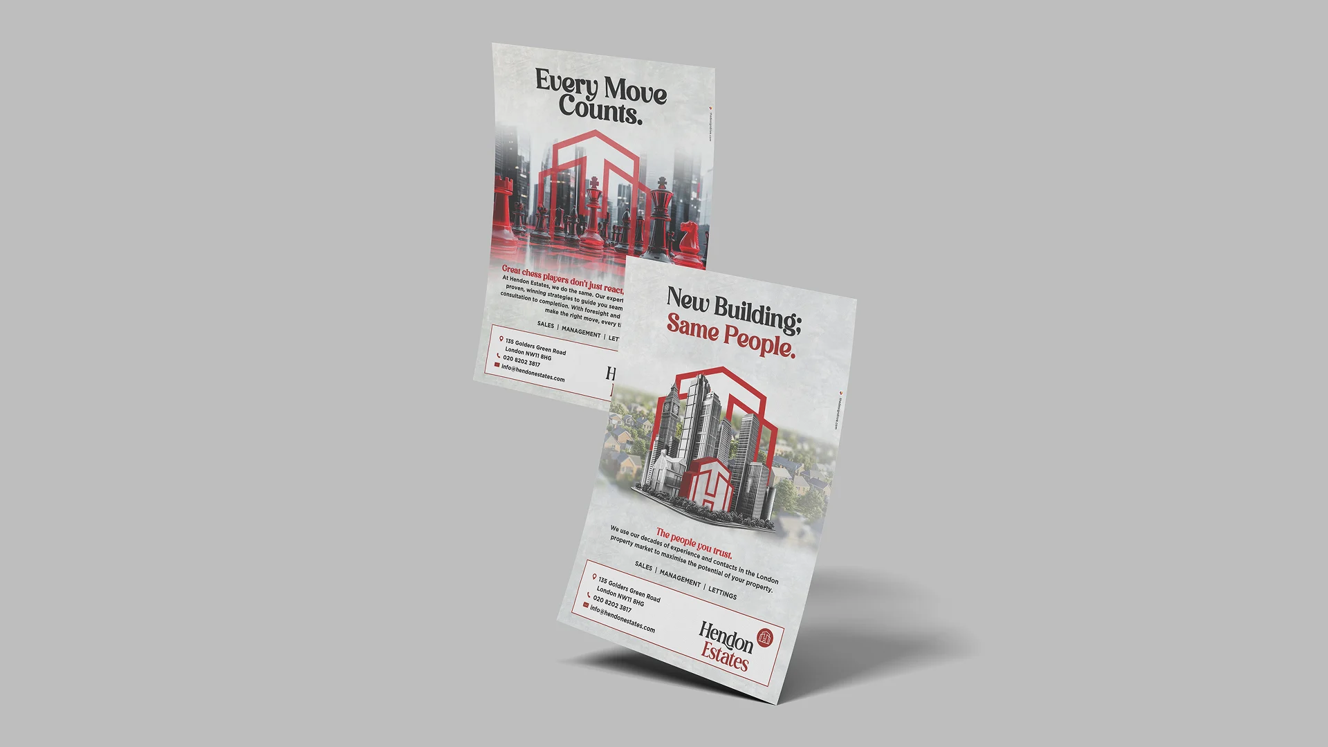
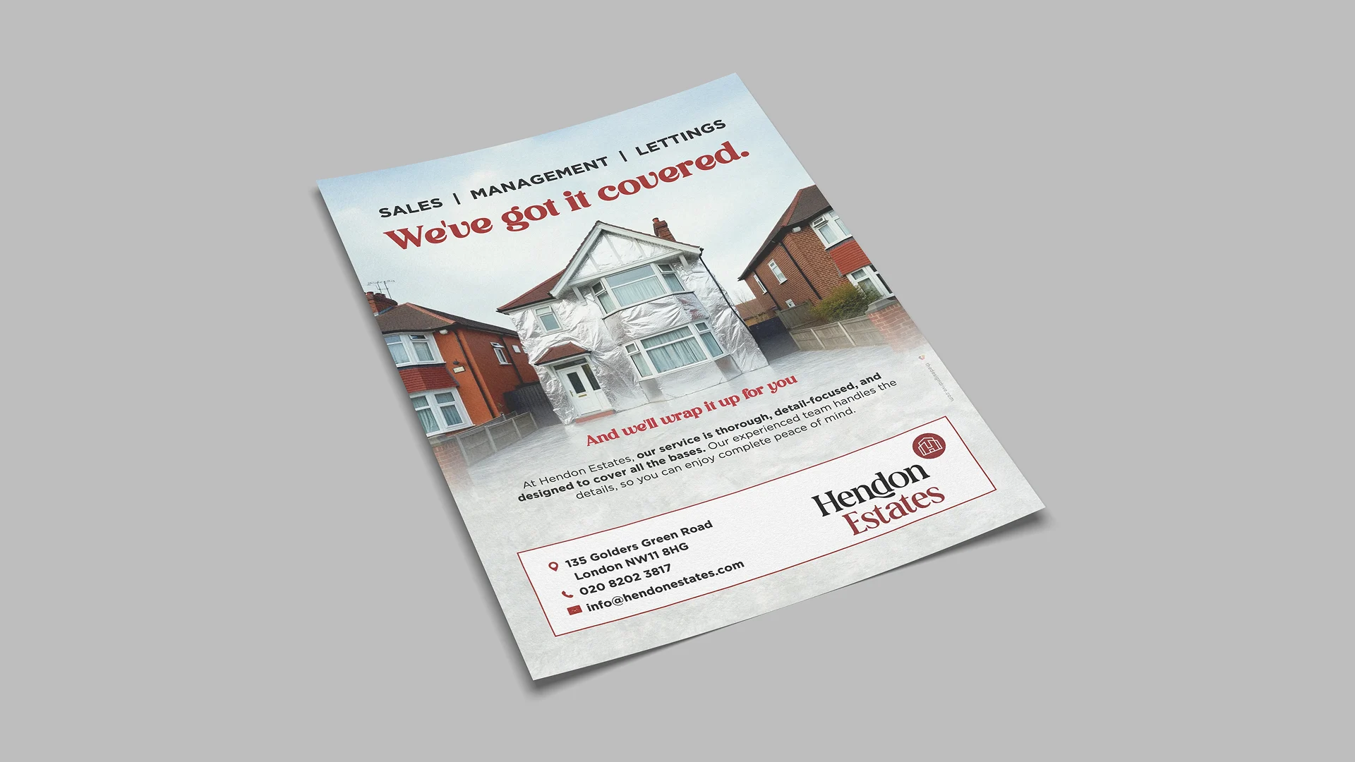
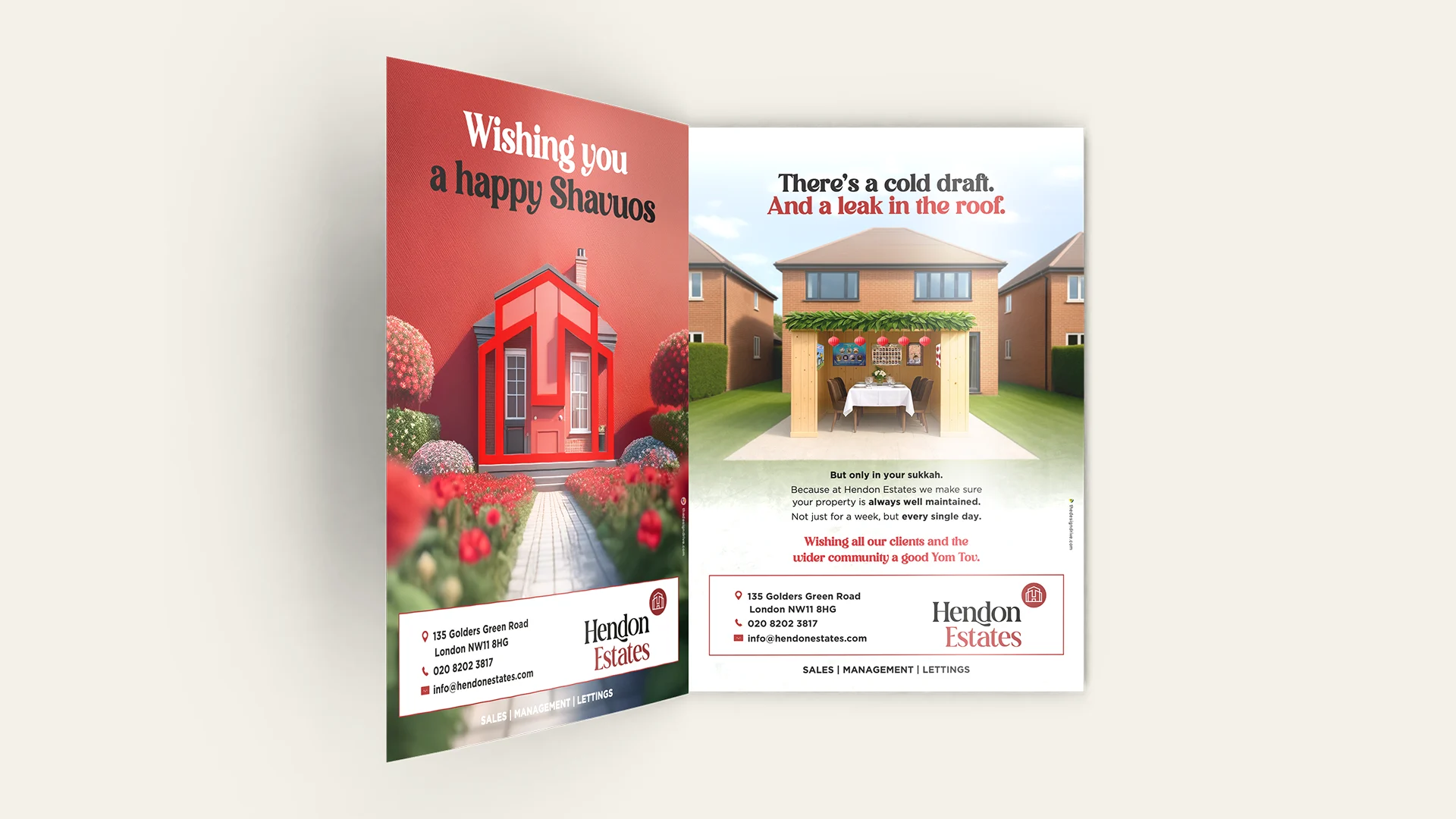
- A refreshed visual identity that feels modern, warm and authoritative.
- A confident, human tone of voice that builds trust from the first line.
- Campaignable advertising concepts that stop people, spark recognition and stay in the mind.
This was behavioural design, not decoration — shifting how people feel so they instinctively choose Hendon Estates over anyone else.
The Result:
A brand that acts like a 24/7 salesperson. It builds trust, signals competence and reassures buyers, sellers and landlords that they’re in safe hands. Their ads now have personality and stopping power, turning perception into preference — and preference into profit.