CLIENT
WHAT WE DO
TAGS
SHARE
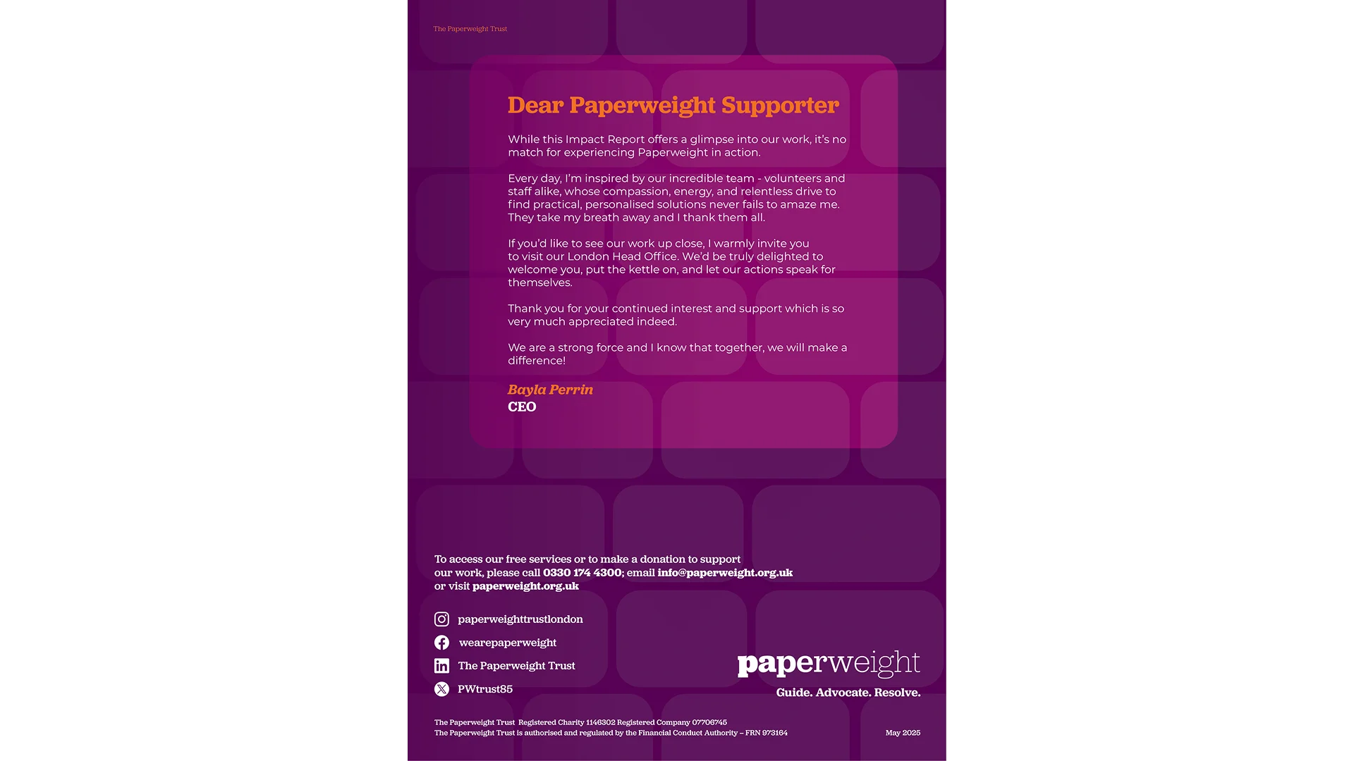
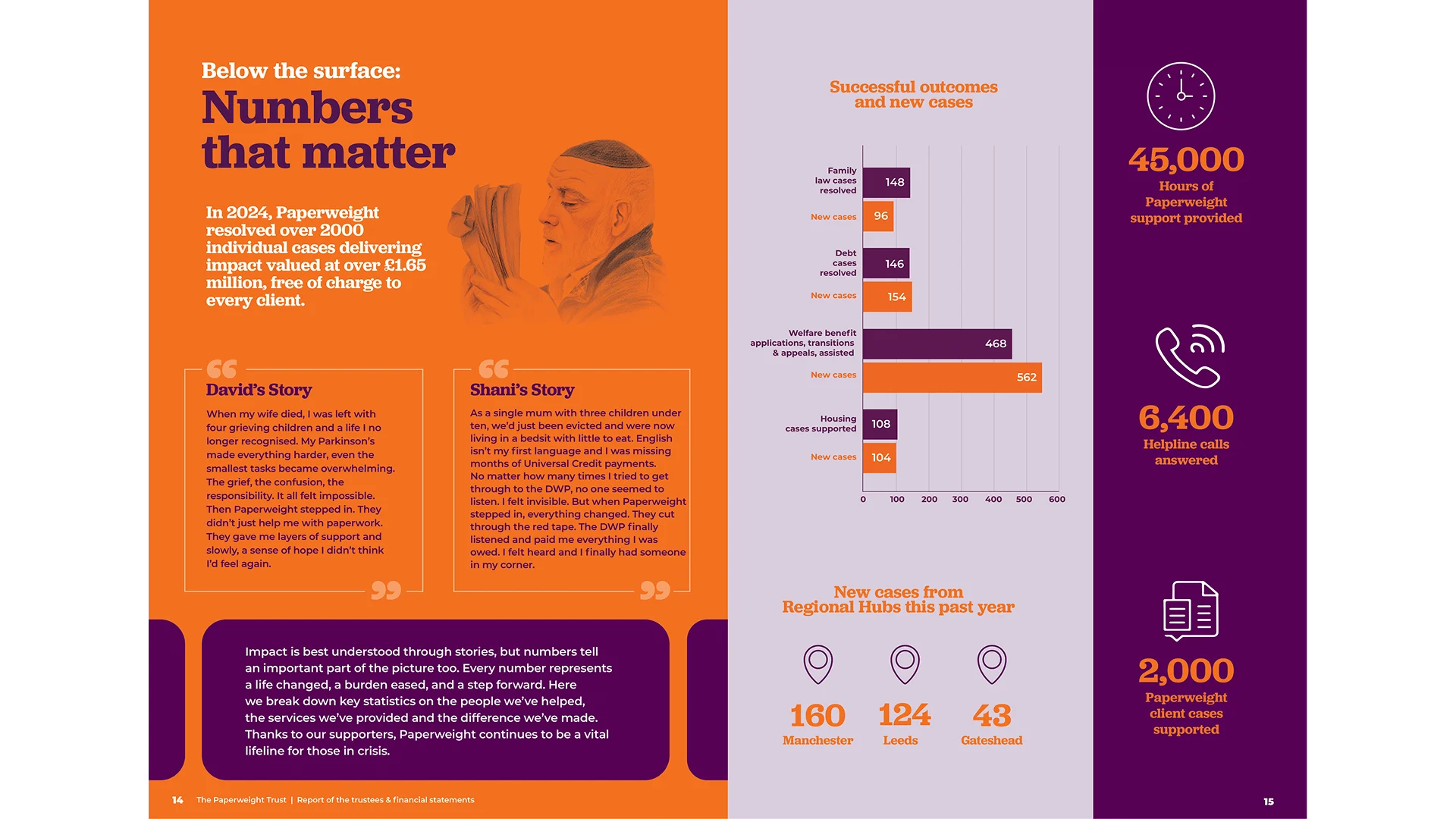
Paperweight is a lifeline for people in crisis, providing free guidance and advocacy for those struggling with legal, financial, and welfare challenges.
When they approached The Design Drive, they already had beautifully written content that told powerful stories of hope and transformation. What they needed was a way to bring it all to life visually.
The challenge was to create a design that would hold emotional weight and clarity at the same time. The report needed to feel calm, trustworthy, and human while guiding readers through complex information in a way that felt simple and inspiring.
We worked hand in hand with Paperweight’s team to turn their content into a cohesive, emotionally engaging piece that felt like an experience rather than a document.
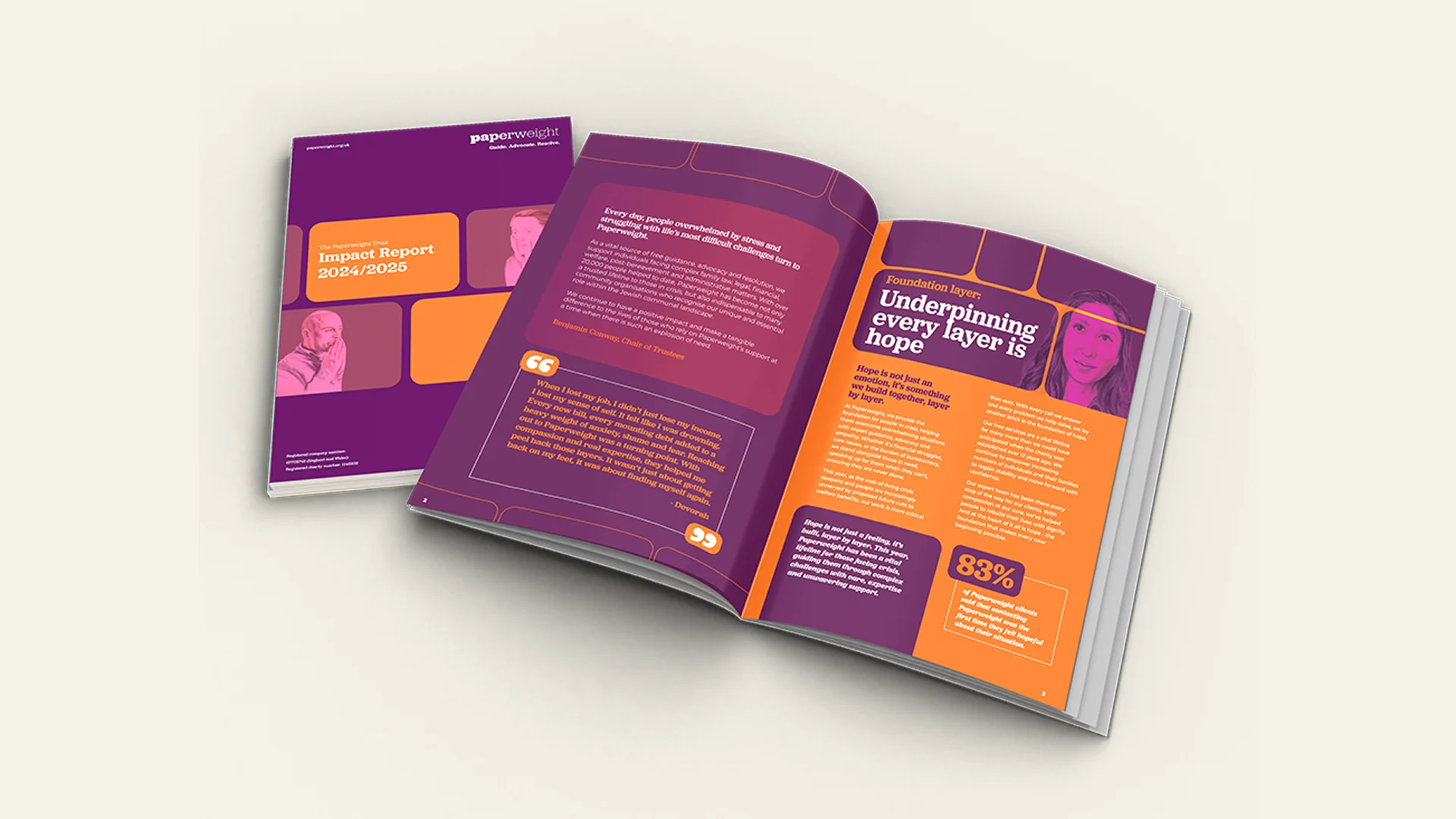
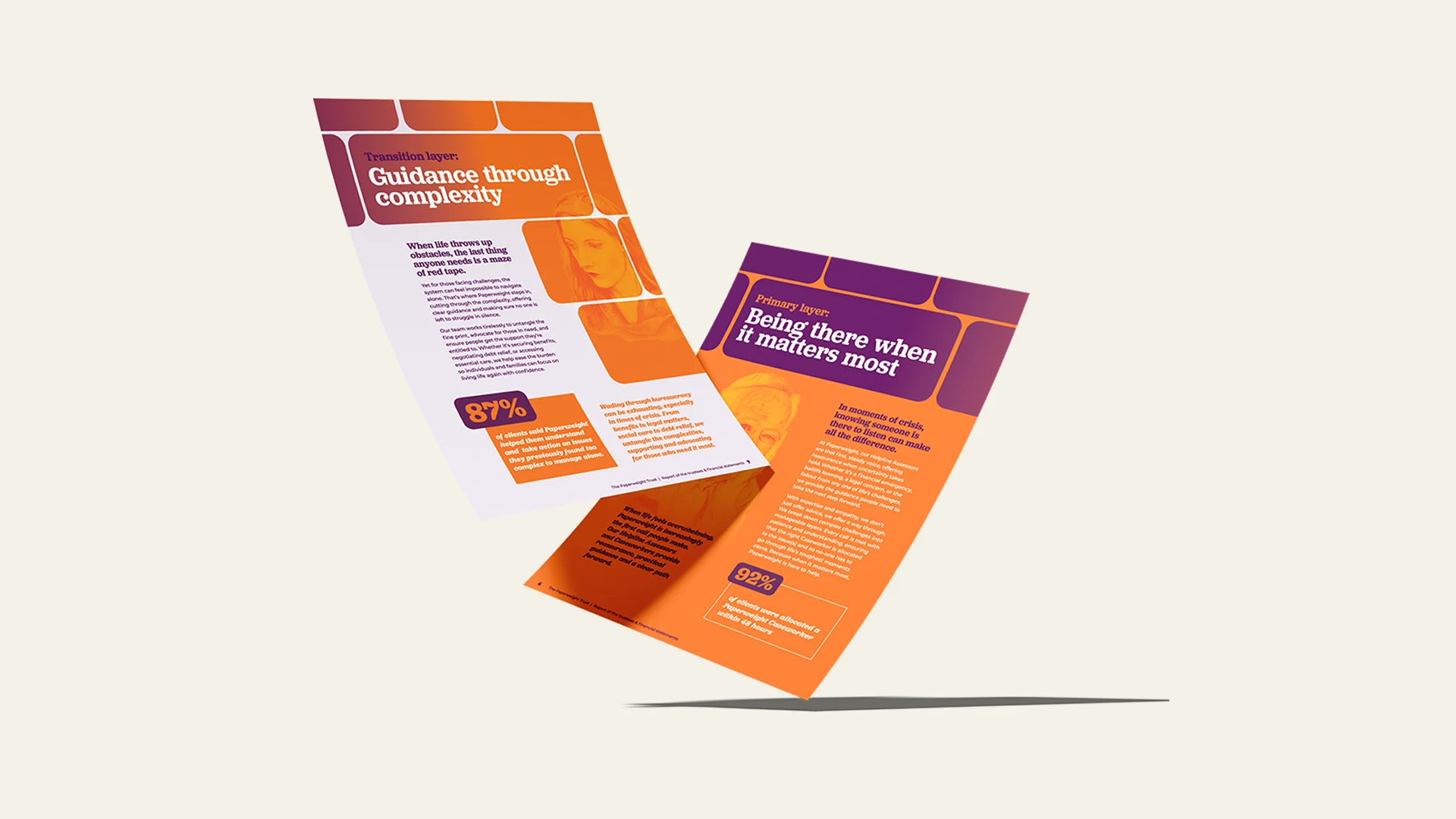
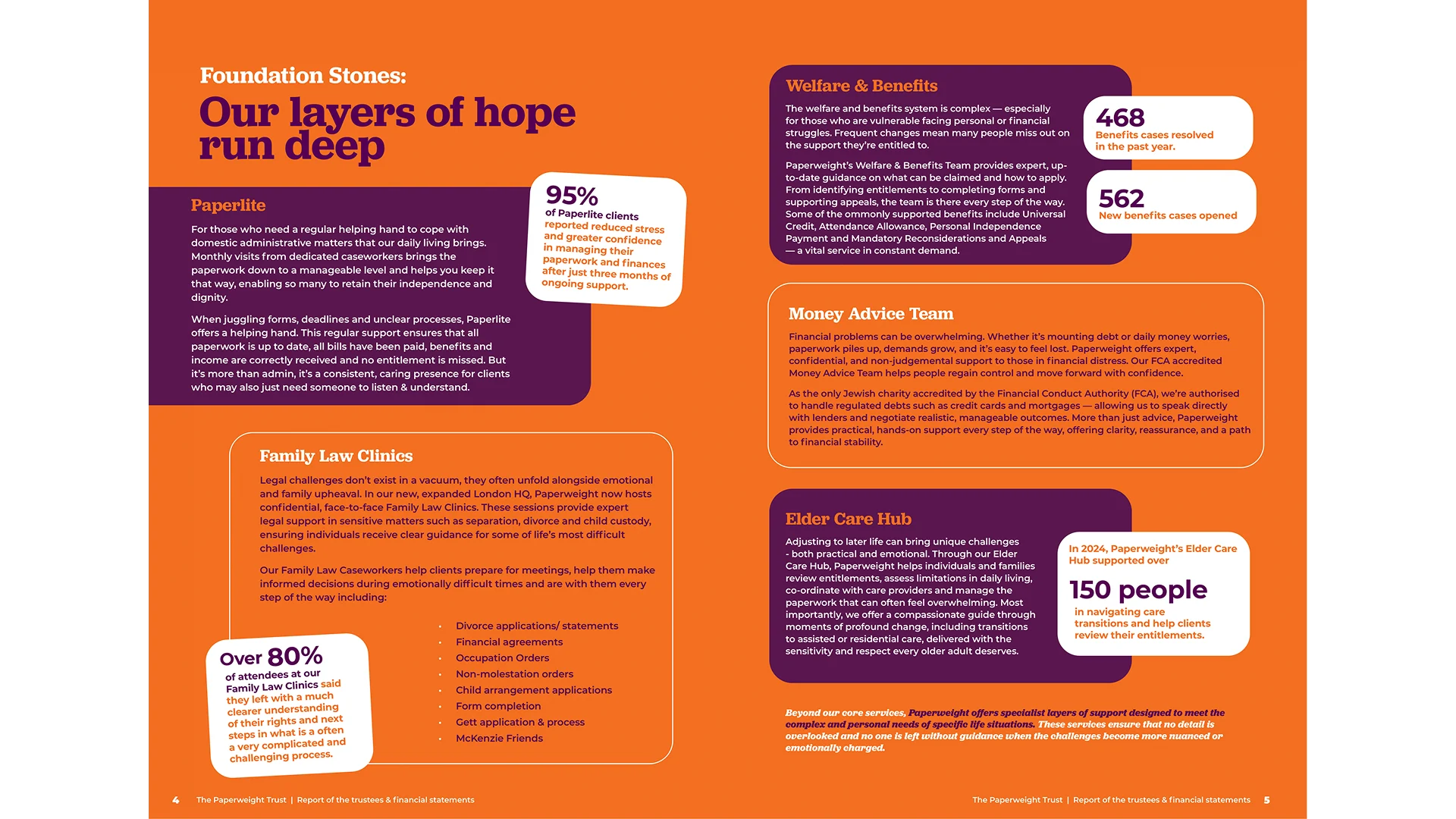
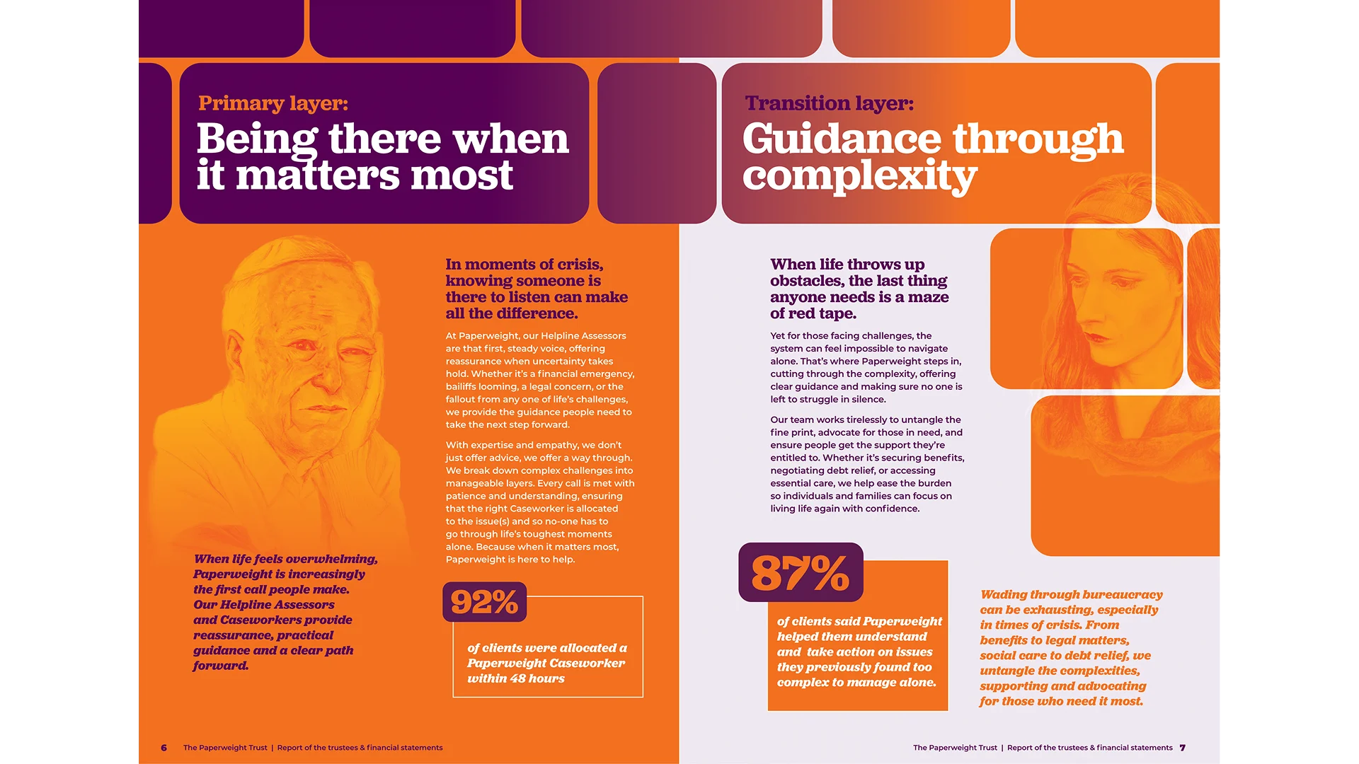
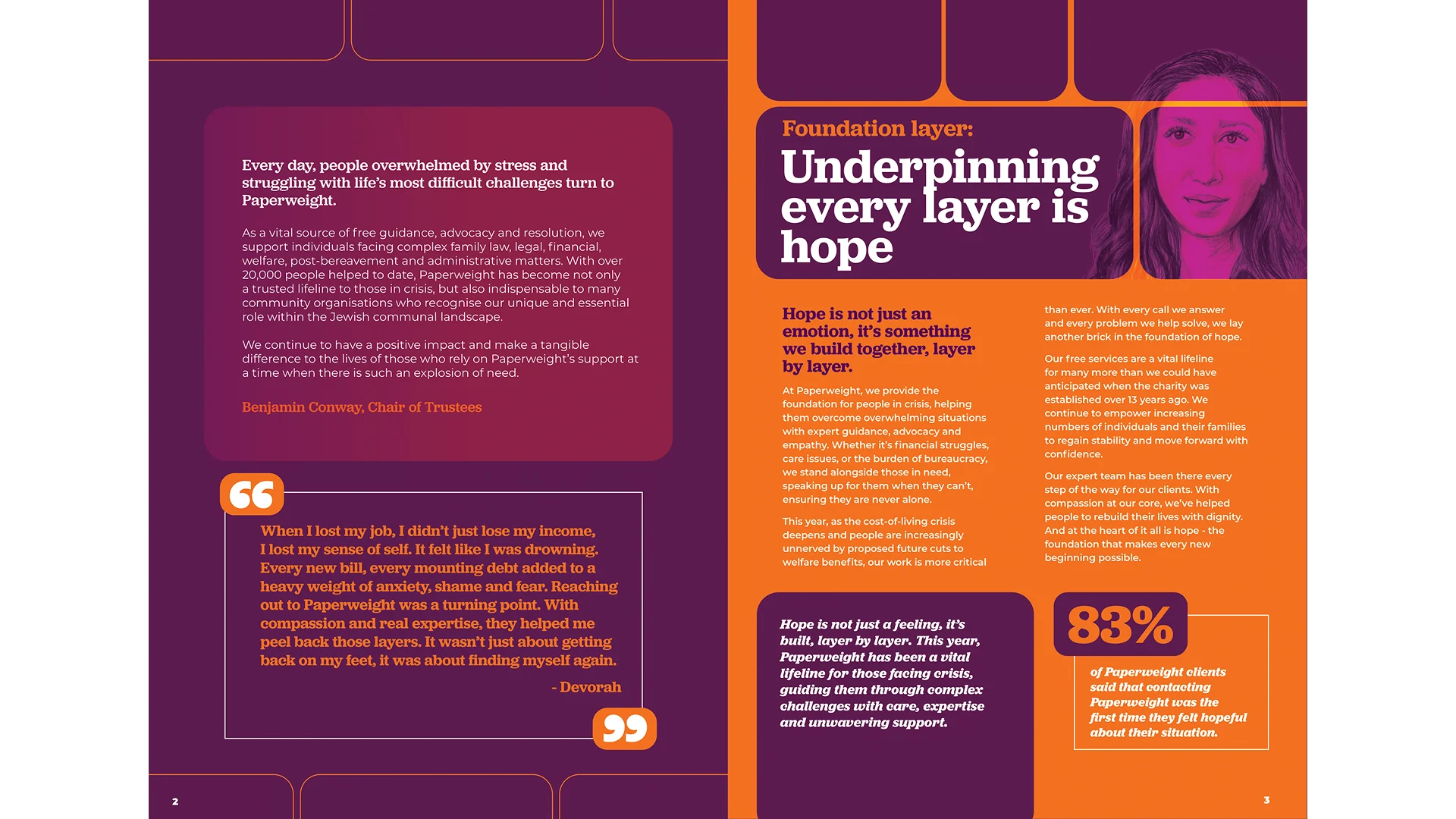
Together, we developed the concept “Underpinning Every Layer is Hope”. This became the creative framework that shaped both the design and structure of the report. Each section represented a different “layer” of Paperweight’s support — from legal help to family guidance to financial stability — building towards the shared foundation of hope.
Our design approach focused on:
The collaboration was fluid and creative. Their team brought heartfelt copy and powerful data, while we shaped the visual rhythm, flow, and storytelling experience that tied it all together.
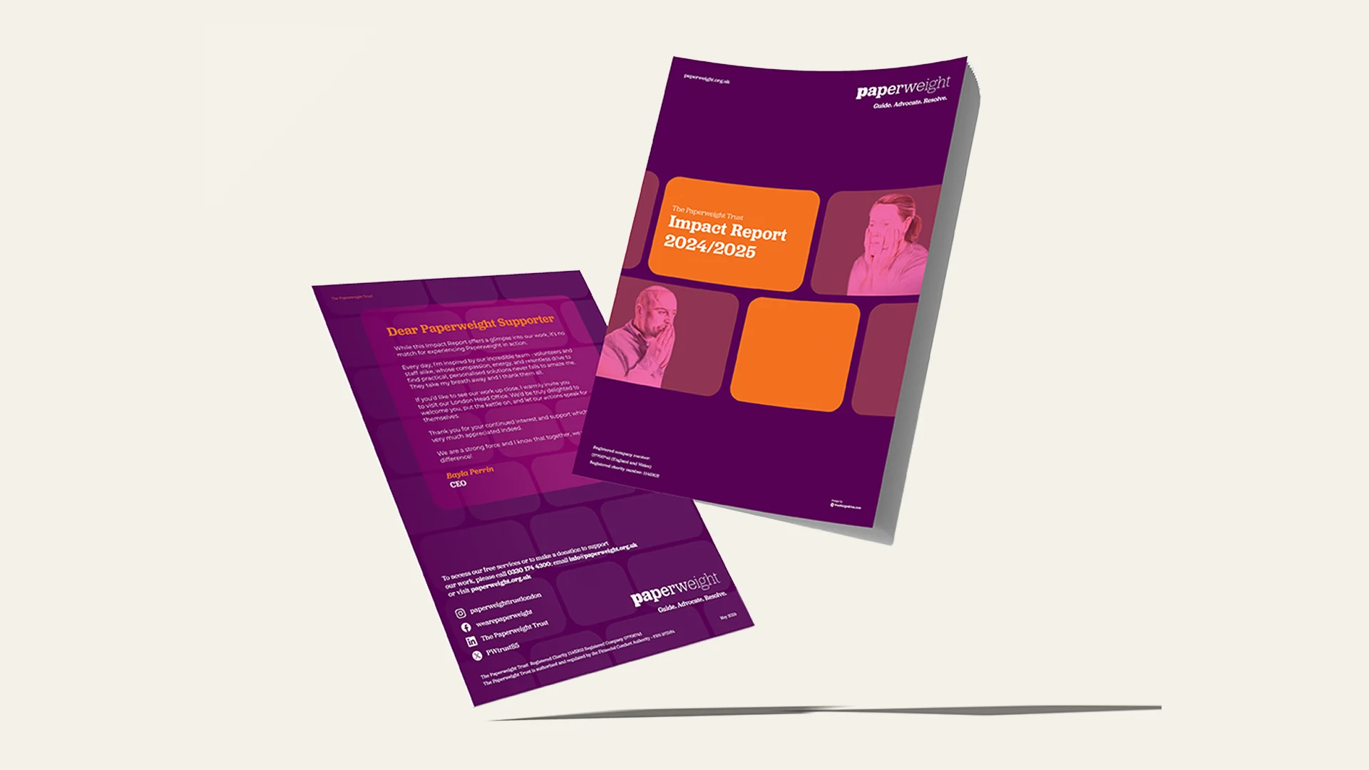
The finished report felt clear, confident, and deeply moving. It captured both the scale of Paperweight’s impact and the sensitivity of their work.
Stakeholders described it as professional yet personal, and the theme of “hope” resonated throughout every page. The layout guided readers effortlessly through each section, allowing them to absorb both the emotional and practical achievements of the year.
The Impact Report became more than an update. It became a reflection of Paperweight’s identity, their values, and their strength as a support system for the community.
When content and design work together, the result isn’t just information — it becomes emotion.
At The Design Drive, we specialise in turning important stories into beautiful, cohesive experiences that people want to read and remember.
This collaboration with Paperweight showed the power of design not just to communicate, but to connect.